EXCERSISES ASSIGNMENT
EXCERSISES ASSIGNMENT
TASK
Create two final A4 designs based on chosen design principles
One must research and find inspiration to explore a journey on how the student ended up with the design.
Design Principle #1: Gestalt Theory
Gestalt theory emphasises that everything is greater as a whole than the sum of its parts. That is, it is not possible to infer the characteristics of the whole from an analysis of its constituent parts. In contemporary German, the word "gestalt" refers to how something has been "positioned" or "put together."
Research
 |
| Fig1.1 In here it explains gestalts theories. I was leaning more to similarity and symmetry. |
INSPIRATION:
 |
| Fig 1.2 By creating 1 design, you can duplicate it multiple times to create a new design |
 | ||
| Fig 1.7 Duplicated into 1 design
|
 | ||
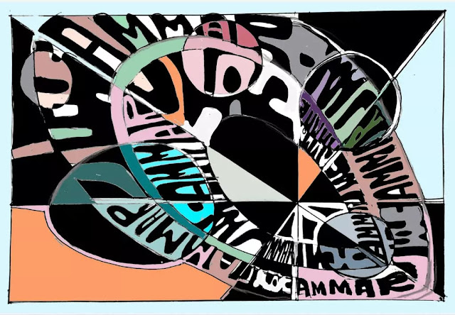
| Fig 1.9 I took the original deign and started collaging it and experimenting by snipping and duplicating it digitally. Finally using the previous method I started colouring it when I was satisfied with how it looks
|
INSPIRATIONS
 |
| Fig 2.1 The designer used letters to form a human cycling. A really good idea to symbolise but its not clear what the sentence is saying. |
 |
| Fig 2.2 I really like how the designer symbolises the building with words |
 | |||||||
| Fig 2.3 This one really stood out for me because I really like how the designer incorporated the design with words. That was my main inspiration. having a font that flows in the design rather than picking out the font earlier on. SKETCHES
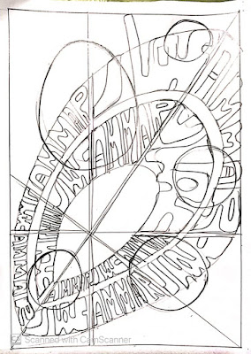
| Fig 2.6 Final sketch without colors |


Comments
Post a Comment